New Landing Page
New look and updated content to showcase more consisely what FreshBuzzer is all about.
Creating a good landing page (aka homepage) is hard, really hard. While I did spend a lot of time on the original landing page, I wasn't really sure how to present FreshBuzzer in a way that's interesting for new visitors.
The biggest change - and the most important - is "above the fold". That is the section of the page that's immediately visible before scrolling down. Think of a folded newspaper, there is a difference between being on the front page "above the fold" and being on the front page "below the fold".
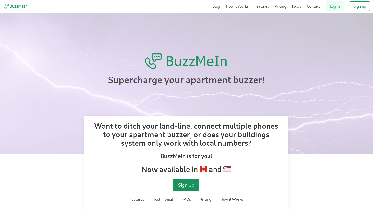
The old page prominently featured a large, full-width banner image, a very vague tag line, a long question as well as many links. None of these things really answer in short and concisely what FreshBuzzer is or what it does. On top of that, the links give the user many options where to go next. But the same links are available in the header and footer. The only real action visitors should take is trying out the service for free!
 Screenshot of the old landing page above the fold
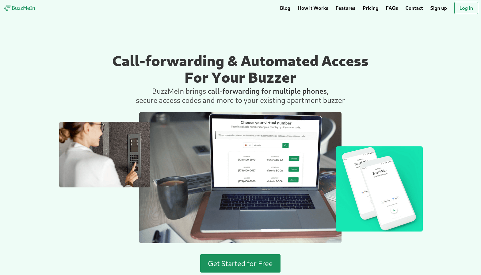
Let me introduce the new landing page... Call-forwarding & Automated Access For Your Buzzer - that's what FreshBuzzer does. It's accompanied by a little more detailed explanation as well as a set of images (three on desktop, just one on smaller mobile screens) that show how FreshBuzzer works. The most prominent is a screenshot of the actual product. The section is rounded up by a Call-to-Action to "Get Started For Free".
 Screenshot of the new landing page above the fold
The next section repeats the value that FreshBuzzer provides and loads an available number in your area. This was pesent on the old page as well but is embedded in more context now.
If the visitor is still there and scrolls down further, they get introduced to the two most prominent features: Call-Forwarding and Secure Access Codes. Both with value preposition, target audience and complete with product screenshot (hidden on mobile to accomodate for the smaller screen).
Lastly the features and testimonal sections haven't changed much. The got a minor facelift to fit the new design.
The goal is to give first-time visitors a better idea about what FreshBuzzer is and if they might want to use it. In the last couple of months 3-5% of the homepage visitors went on to the sign up page. And around 5-6% of the people who went to that page actually signed up for our Free Trial. While those are not bad numbers at all, I hope more people learn about FreshBuzzer, find it useful and sign up.
Do you like the new landing page? Please don't hesitate to reach out and let me know what you think.
Cheers,
Axel